Philadelphia Corporation for Aging Website Redesign
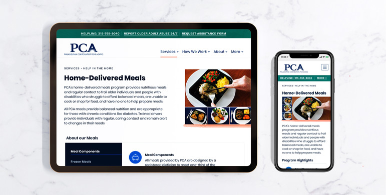
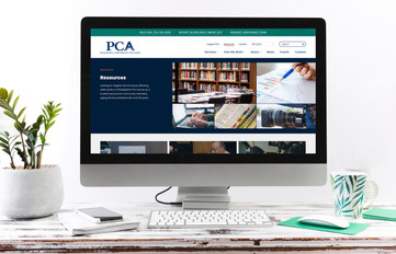
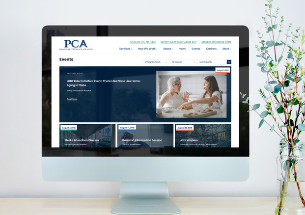
Philadelphia Corporation for Aging offers comprehensive services, but its existing site was underperforming as a resource for Philadelphia’s seniors. As the lead designer on this project, Cami helped restructure the content of the website and update the look and feel of the site into a friendlier, more digestible guidebook of services.
Service
Website Redesign
Client
Philadelphia Corporation for Aging
Year
2021





Project Overview
-
Discovery: A comprehensive understanding of PCA's objectives, user needs, history, products, and audience was crucial. This phase involved a 28-page questionnaire distributed to PCA's C-suite and Marketing teams to provide insights. Meetings were held with key stakeholders to capture company preferences and potential future challenges.
-
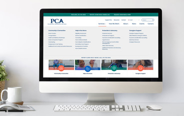
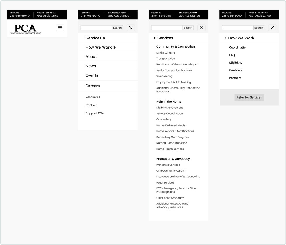
UX: This phase aimed to enhance the user experience, starting with a site audit, site map, wireframes, and user flow. The goal was to streamline navigation, resolve inconsistencies, and create a user-centric design.
-
Brand: An audit of PCA's brand identity was conducted to ensure alignment between the visual and online identities. Accessibility testing and market research helped shape the brand strategy, including color schemes, typography, imagery, and icons.
-
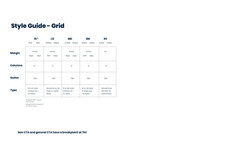
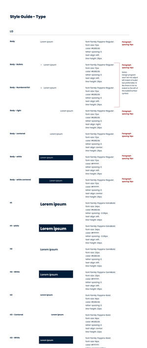
UI: The User Interface (UI) design phase incorporated inspiration and market research to develop a cohesive design concept. A design system was created for consistency across five different screen sizes and responsiveness. This phase also produced a style guide and development guide for future reference.
-
Build: Collaboration with developers ensured the seamless transition from design to implementation. Quality assurance measures were implemented, leading to the final website launch.


Initial Discovery
Understanding PCA's Vision - PCA's primary goal was to enhance services for older Philadelphians through digital technology.
Stakeholder Engagement - Top management and marketing teams were extensively engaged through a 28-page questionnaire, aligning objectives and understanding PCA's unique challenges.
In-Depth Interviews - Consulted in meetings with internal teams and special groups and ensured a holistic view of PCA's operations, identifying opportunities to enhance user experiences.
Defining Project Goals
The Discovery phase led to the crystallization of key project goals:
-
Mobile Accessibility - PCA aimed to enhance the mobile user experience and bring the website in line with accessibility standards.
-
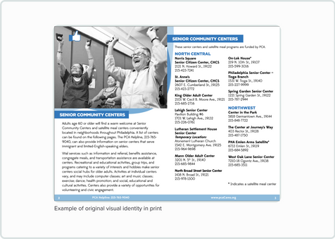
Brand Consistency - Discrepancies between PCA's visual identity in print and online were identified and slated for resolution.
-
User Navigation - A major objective was to streamline user navigation, reduce inquiries to the call center, and restructure the services section for clarity.

Information Architecture
Planning for the User - With the insights from the Discovery phase in hand, the UX phase aimed to put the user at the center of the design process.
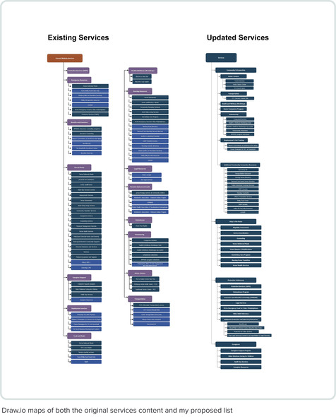
Site Mapping - Compiled the full library of all the different potential services, and reorganized them into groups based on audience. Removed 36 pieces of outdated or extraneous content from the PCA site.
Site Audit - Identified common pitfalls for navigation:
-
Duplicate pages
-
Relevant content for a user is scattered across multiple locations.
-
Unclear labels
-
Discrepancies between the content the user expects to find and what is available in the location they are searching
System Planning - Created a custom, modular design system via the WordPress Gutenberg editor and compiled a written list of the different blocks and their intended uses.



Design System for Flexibility
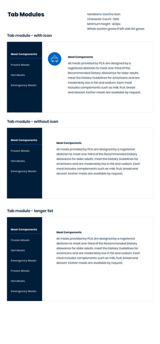
Cami designed a custom modular design system was created to accommodate PCA's vast amount of content effectively. This system was designed to be implemented via the WordPress Gutenberg Blocks. A detailed list of design blocks and their intended use ensured the retention or surpassing the original site functionality.
High-Fidelity Wireframes
Cami Produced high-fidelity wireframes for every page, serving as a roadmap for PCA's content writers during the development process. These wireframes ensured that the designed blocks could adapt seamlessly to various types of content.


Branding Phase
Unifying Visual Identity
PCA's digital transformation journey began with a critical examination of its branding. The Brand Audit phase aimed to unify the visual identity across print and web platforms. It became evident that PCA's brand appeared significantly different in various contexts, from secondary colors to fonts, black, and imagery styles. A resolve to bridge the gap between visual and online identities emerged as a primary goal.
Market Research and Inspiration
Performed extensive market research and exploration for inspiration. Colors, typography, imagery, and icons were carefully selected to create a cohesive brand experience. Accessibility testing played a crucial role in ensuring that the brand elements were inclusive and user-friendly.


Icons, textures & Imagery
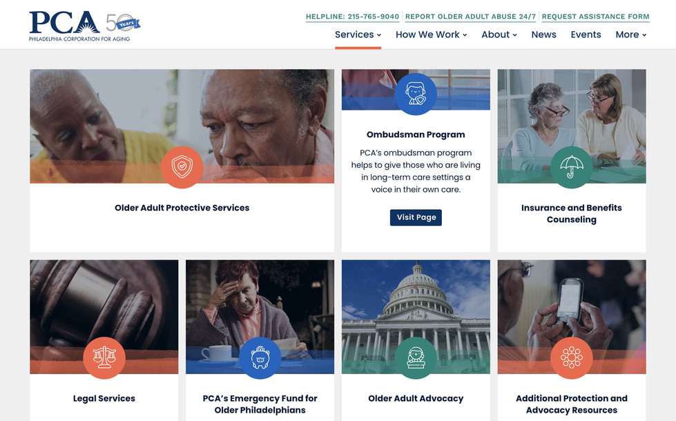
To achieve a warm and inviting visual brand that instills a sense of joy and hope in users, Cami utilized watercolor textures, colorful imagery, and Kawaii-style icons to pair with the updated palette and fonts.
Processed icons didn't include backgrounds to ensure that each icon grid module could retain the same color pattern.


UI Phase
Unifying Elements with Precision
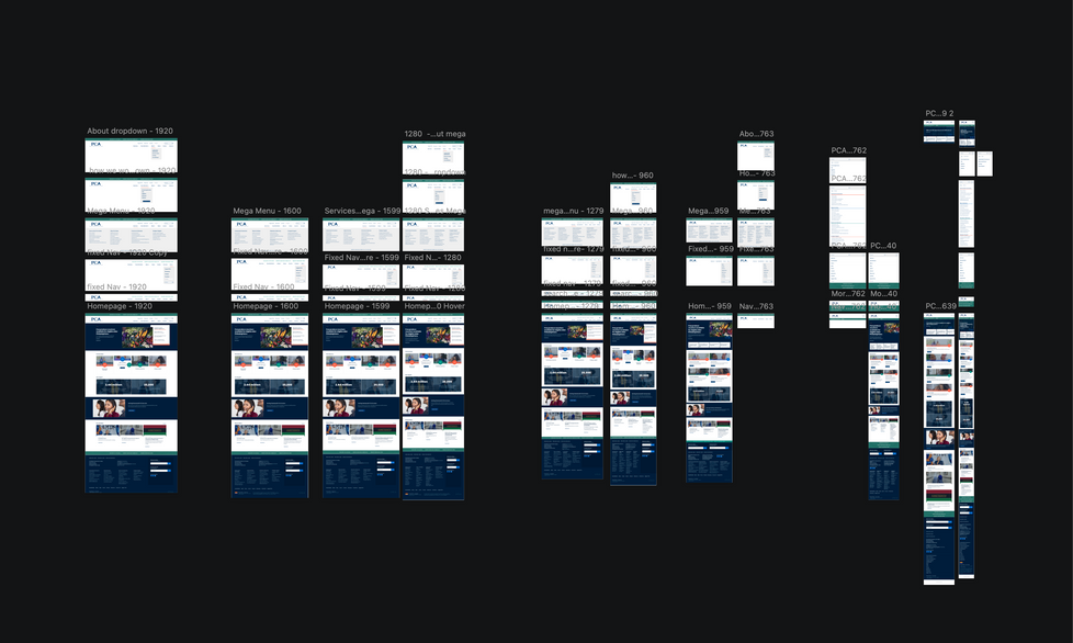
Once a few important pages were approved by the client Cami updated all necessary wireframes into high-fidelity designs and resolved the UI in five breakpoints. The beauty of the modular system is that only the modules and unique page templates needed to be created to proof the system and hand it off to the dev.






Conclusion
The Discovery and UX phases of the PCA website redesign project exemplify the importance of careful planning and research in delivering a successful digital transformation. The Branding and UI phases of the PCA website redesign project addressed branding inconsistencies, and leveraged market research and inspiration to create a cohesive brand identity while high-fidelity designs and UI enhancements improved user navigation and content presentation.
The result was a seamless and efficient process that aligned PCA's digital identity with its mission of better serving older Philadelphians, ultimately creating a more inclusive, welcoming, and user-friendly online platform.

